Flat Earth
Every map of the world is really a caricature. There are two reasons for this. One is the geometry of the planet itself, and the other is the culture of the cartographer who makes the map. Even the advent of Google has changed nothing. By Daniel Di Falco
(From "Horizons" no. 111 December 2016)
Es The year was 2003, the topic North Korea. The English magazine The Economist wanted to explain to its readers the danger that Pyongyang's nuclear missiles posed to the world. It did so with a map of the world on which distances were marked by concentric circles. Taepodong-2, the newest missile developed by North Korea, was supposedly able to transport a warhead over 9,000 miles. That meant that all of Asia was in danger, as the map demonstrated – but the West was safe.
Today you can find the Economist's map in cartography textbooks as an example of how misleading the use of certain maps can be. The Economist had marked out the possible radius of the rockets on a map that was based on the Mercator projection. But this kind of map offers a poor depiction of the curvature of the Earth. In contrast to what the map suggests, the shortest path from Asia to the USA is not from west to east across the Pacific, but across the Arctic to the north.
Two weeks later, the Economist published a corrected version, according to which the Taepodong-2 was able to reach both Europe and the USA. The circles had been made into oval forms – and one could hardly offer a more striking demonstration of what the Mercator projection does to the world: it inflates its proportions, and does so the most towards the Arctic and Antarctic. This is why the same distance appears longer, the closer it is to one of the poles. And this is also why Greenland appears to be as big as Africa on these maps.
An image is not an exact likeness
The Earth is round, but maps are flat. There will never be a perfect solution for projecting a three-dimensional body onto a two-dimensional plane. Every projection brings a certain amount of distortion with it. According to the procedure one uses, the length of a line, the size and form of a surface area or the angle between two lines will change. Some projections are faithful to angles, others to distances or surfaces. That is a matter of applied mathematics – but it isn't the whole story. "Projections don't just create maps of the world: they also communicate ideologies", says Julia Mia Stirnemann. She is a graphic designer and has been looking into the 'constructional and ideological conventions' that we find in maps of the world. Her doctoral thesis deals with graphic design, geography and cultural history, and was part of an interdisciplinary project at the Bern University of the Arts and the University of Bern, entitled 'Mapping Worldmaps'.
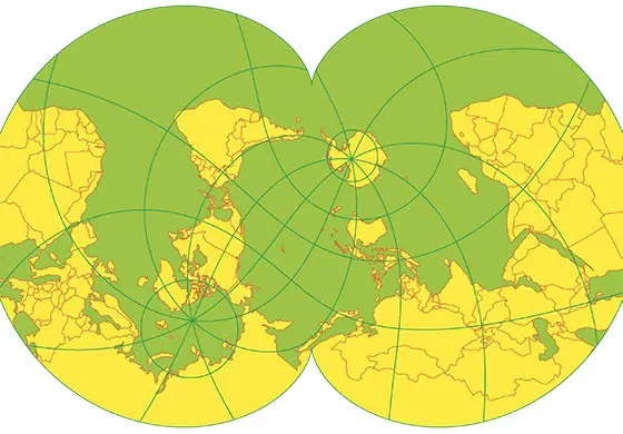
Azimuthal equidistant
Cartographers have been grappling with the problem of projections since Classical times. Today, the different procedures employed "aren't a challenge any more in either mathematical or technical terms", says Stirnemann. For some time now, attention has been focussed increasingly on the societal baggage that is conveyed by the way the 'earth sciences' look at the world. If maps are not an exact likeness of things as they are, but only images of them, what cultural parameters also flow into their construction? This is what Stirnemann has been investigating.
A subjective centre of the world
'About projections' is the title of her study. It reaches back into Classical times to investigate the concepts of Anaximander, Eratosthenes and Ptolemy. Even if their creations were far removed from what we would regard as a usable map today, they are all the more interesting for showing us how our mapped visions of the world are determined by 'paradigmatically predominant explanatory models' of the things and people in our global order. The symmetries of the early Greek maps, for example, reveal the teachings of their natural philosophy, and while their 'centres' were situated in Delphi or Alexandria – which were the centres of political and cultural power at the time – their midpoint later shifted towards Jerusalem. The centre of the map always signified the centre of the world; it was from this starting point that the Earth was conceived, and its boundaries defined and drawn.
This was just as true for the Middle Ages in Christendom. It was no longer the geometry of the world, but God who kept the world together. Occasionally, it was even Christ or the Cross that provided the form of maps. And the North wasn't at the top, but the East – because people thought that's where paradise lay. Maps were less an aid to spatial orientation than a demonstration of God's global reach. They comprised the places relevant to the Christian history of salvation and other biblical motives. This gave maps a temporal dimension besides their spatial aspect.
Maths hides vantage points
It was in this manner that cultural perspectives inserted themselves between the world and our images of it. A map is more than just "a conventional arrangement of data", writes the geographer Jacques Lévy in his article 'A Cartographic Turn?'. Lévy works at EPFL and is investigating the origins and the future of cartography, which is really also a 'language' – albeit a language that has, since the Renaissance, increasingly insisted that it is objective and absolute. In the course of becoming a 'science', the art of mapping oriented itself on standardised mathematical models. This allowed it to hide its metaphorical vantage point – though hiding it didn't make it simply disappear.
During the Cold War, cartographers in both the East and the West used the Mercator projection to have the Soviet Union appear particularly large – as a demonstration of its power and of its supposed threat to the rest of the world, respectively. Setting the prime meridian in Greenwich and the traditional position of Europe at the centre of a map also helped to emphasise the East-West division of the world, along with the respective pretensions to power of each side.
It was just such entanglements with politics and projections, hegemony and cartography that the 'radical geography' of the 1970s aimed to overcome. And it is not a little ironic when we consider just where this democratisation and pluralism of map-making has brought us. In the digital era, the products of Google are available everywhere, but this means they have also become universal norms. There is now a new imperialism to criticise – one that is no longer concerned with controlling territories, but with controlling data about these territories.
Elastic worldviews
Mercator projection
Above and beyond this, Stirnemann also demonstrates how Google's designs of the world support the continued relevance of the eurocentrism that was thought to have been overcome. In Google Maps, a user can choose his or her standpoint and focus, but this does not change the fact that the whole world is oriented around Europe and is constructed with it as its starting point. The basic map is based on a traditional Mercator projection and perpetuates its notorious distortions. So whoever uses Google Maps in Africa will still be standing on a continent that is no bigger than Greenland.
Onwww.worldmapgenerator.com, we can see just how much our image of the world can really change if we shift the midpoint of a map, and thereby also shift our perspective of the world. It is an app that Stirnemann has developed with a team at the Bern University of the Arts. It lets you generate "unconventional world maps" in a playful fashion; different projections can be combined with freely selectable midpoints. The result is a series of worlds that barely look anything like the one to which we are accustomed, even though they are constructed using the same mathematical rules and are no less 'true'. No world map is possible without distortions of some kind – but which areas are affected by such distortions (and which areas aren't) depends on where the cultural and political power lies.
Can art offer a solution?
We could describe such an approach as 'deconstruction', as Stirnemann does – taking her cue from the cartographer John Brian Harley ('Deconstructing the map', 1989). Or we could see it as a practical contribution to a theory of relativity of cartography. Either way, it fits a current trend in research that sees Lévy's 'cartographic turn' on the horizon. And while cartography might owe its scientific status and its technical efficiency to its mathematical formalisation, says Lévy in his article, it paid for this development by an 'impoverishment' of its language, its creativity and its expressive power. Today, digital surveys have dramatically developed our view of the world, almost without any participation on the part of academic cartographers. This is why Lévy focusses on pre-Modern times, when maps were still able to convey different worldviews and measurements at the same time. He is also investigating non-Euclidic geometries and aspects of both time and space. In these approaches, as also in non-European map concepts and in contemporary art, Lévy discerns an 'innovative logic' that could free cartography from the corset it wears today.
The path could be a long one. Because while maps are primarily a means of orientation, the viewing habits and cultural norms that they incorporate are tenacious in nature. The "most striking event in the history of images of the world", according to the art historian Horst Bredekamp, was the photo that the crew of Apollo 17 took on 7 December 1972. It shows the Earth as a blue sphere with swirling white clouds above Africa and the Antarctic. This image achieved iconic status, but only after NASA turned it on its head to make it recognisable. The original image had the South Pole at the top. Unlike our maps that shape the way we see the world, the Universe knows neither top nor bottom.
Daniel Di Falco is a historian and a journalist at Der Bund in Bern..